White Labeling
White Labeling allows Tenant Administrators to customize the SignalSync platform's visual appearance to match their organization's brand identity. From logos and color schemes to typography and UI elements, you can create a fully branded experience for all users within your tenant.
Overview
SignalSync provides comprehensive white labeling capabilities through two main sections:
- General: Upload your organization's logos and customize the login background
- Appearance: Configure themes, colors, typography, and detailed UI styling
These branding settings apply to all users within the tenant, ensuring a consistent branded experience across your organization. Users retain the ability to toggle between light and dark modes based on their personal preference, but all branding elements remain consistent across both themes.
White Labeling features are exclusively available to users with the Tenant Administrator role. Changes made to branding settings are applied immediately to all users within the tenant without requiring user action or system restart.
Accessing White Labeling Settings
- Navigate to Settings from the left sidebar
- Select White labeling from the settings menu
- Choose between the General or Appearance tabs
General - Brand Assets
The General tab allows you to upload your organization's visual identity elements that will appear throughout the SignalSync platform.
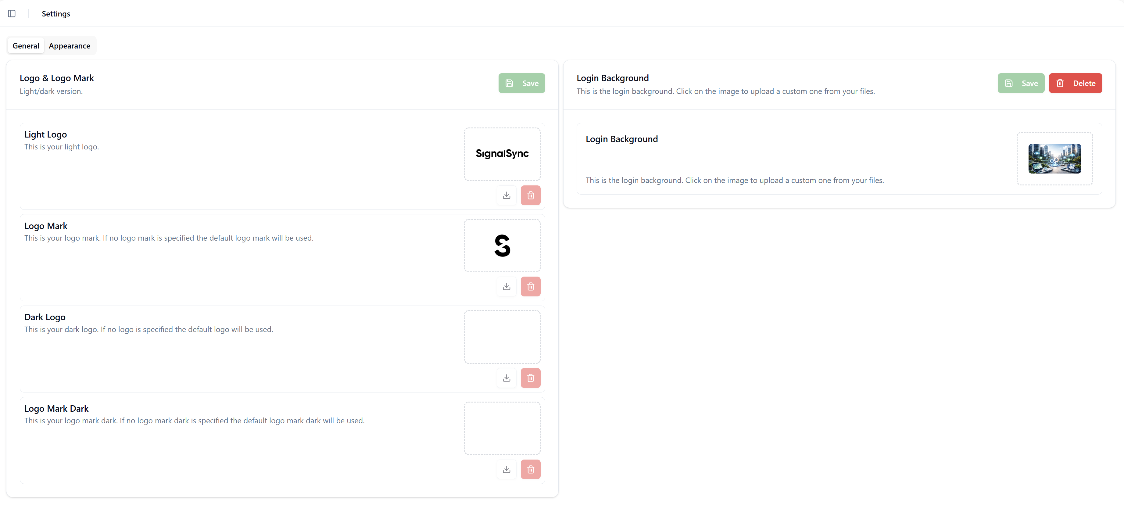
Logo & Logo Mark
Your organization's logo appears in the top-left corner of the SignalSync interface. The platform uses two logo variants depending on the navigation sidebar state:
- Logo (Full): Displays when the sidebar is expanded, showing your complete brand name and mark (e.g., "SignalSync" with full text)
- Logo Mark: Displays when the sidebar is collapsed, showing only the icon or abbreviated mark (e.g., just the "S" symbol)
Uploading Logos
-
Navigate to the Logo & Logo Mark section in the General tab
-
You'll see separate upload areas for:
- Light Logo: Used when the interface is in light mode
- Logo Mark: The compact version for collapsed sidebar
- Dark Logo: Used when the interface is in dark mode
- Logo Mark Dark: The compact dark mode version
-
Click on the upload area or use the download icon to select your image file
-
Click the Save button to apply your logos
File Requirements:
- Accepted formats: JPEG, PNG, WebP
- Maximum file size: 1 MB per logo
- Recommendation: Use transparent PNG files for logos to ensure they display properly on different backgrounds
The Logo displays in the expanded sidebar providing full brand visibility, while the Logo Mark appears in the collapsed sidebar to save space while maintaining brand recognition. Both variants should be visually consistent with your brand identity.
Each logo can be downloaded using the download icon or deleted using the delete (trash) icon next to the upload area.
Login Background
Customize the background image that users see on the SignalSync login page, providing a branded first impression of your platform.
Uploading Login Background
- Navigate to the Login Background section in the General tab
- Click on the background image placeholder
- A file upload dialog will appear where you can drag and drop or select your background image
- Select your desired background image
- Click the Save button to apply the changes, or Delete to remove a previously uploaded background
File Requirements:
- Accepted formats: JPEG, PNG, WebP
- Maximum file size: 2 MB
- Recommendation: Use high-resolution images with dimensions appropriate for various screen sizes (recommended: 1920x1080 or higher)
If no custom login background is uploaded, SignalSync will display the default branded background. The login page adapts to both light and dark modes based on user preference.
Appearance - Theme Customization
The Appearance tab provides a powerful Theme Editor that allows you to create comprehensive visual themes for your SignalSync instance. You can select from predefined themes or create custom themes tailored to your organization's brand guidelines.
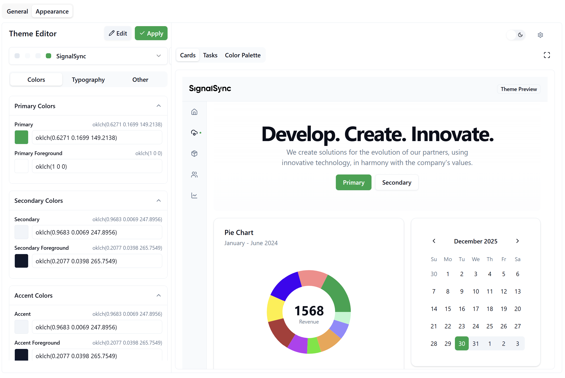
Theme Editor Overview
The Theme Editor is divided into two main areas:
- Configuration Panel (Left): Where you select and customize theme properties
- Live Preview (Right): Real-time preview showing how your theme changes will appear in the application
Working with Themes
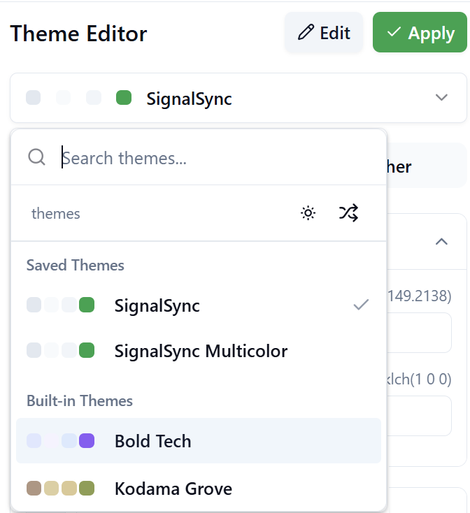
Selecting a Predefined Theme
SignalSync comes with many professionally designed themes that you can apply immediately or use as a starting point for customization.
-
Click on the theme dropdown in the Theme Editor
-
Browse through available themes in two categories:
- Saved Themes: Custom themes you've created and saved
- Built-in Themes: Pre-designed themes provided by SignalSync (e.g., Bold Tech, Caffeine, Candyland, Claude, Claymorphism, Clean Slate, Cosmic Night, Cyberpunk, Elegant Luxury, Kodama Grove, and more)
-
Select a theme to see it applied immediately in the preview area
The theme selector includes a search function and filter options for light/dark theme variants to help you find the perfect starting point for your brand.
Creating Custom Themes
To create a truly unique branded experience, you can customize every aspect of your theme across three configuration tabs: Colors, Typography, and Other.
Colors Tab
The Colors tab allows you to define the color palette that will be used throughout the SignalSync interface.
The color configuration is organized into several expandable sections:
Primary Color Categories:
- Primary Colors: The main brand colors used for buttons, links, and key interactive elements
- Secondary Colors: Supporting colors for backgrounds, secondary actions, and less prominent UI elements
- Accent Colors: Highlight colors used for focus states, notifications, and emphasis
Additional Color Groups: Beyond the primary categories, you can customize colors for specific UI components including base colors, card backgrounds, popover elements, muted tones, destructive actions (errors/warnings), borders, inputs, chart colors for data visualization, and sidebar styling. These granular controls allow you to create a cohesive visual experience that extends to every corner of the application.
For each color property, you can specify values using various formats including HEX codes, RGB, HSL, or OKLCH color spaces. The interface provides color pickers for visual selection and displays current values for precise adjustments.
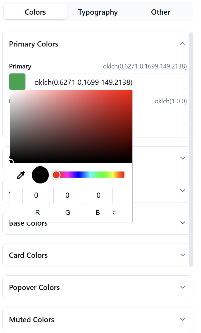
The Chart Colors section allows you to define up to 10 distinct colors for data visualization. These colors ensure your charts and graphs maintain brand consistency while remaining visually distinct for data clarity.
Typography Tab
Customize the fonts used throughout the SignalSync interface to match your brand's typography guidelines.
Font Family Configuration:
The Typography tab allows you to select fonts for three primary use cases:
- Sans Serif Font: Used for most interface text, headings, and body content
- Serif Font: Used for specific stylistic elements or formal content
- Monospace Font: Used for code blocks, technical data, and fixed-width content
Each font category offers a dropdown selector with numerous professional font options including:
- System fonts for optimal performance
- Web-safe fonts like Inter, Roboto, and Open Sans
- Developer-focused fonts like JetBrains Mono, Fira Code, Source Code Pro, IBM Plex Mono, Roboto Mono, Space Mono, and Geist Mono
Fonts Showcase:
Below the font selectors, the Fonts Showcase section provides a real-time preview of your selected fonts. This preview displays sample text in various styles, weights, and sizes, allowing you to see exactly how the fonts will appear in the application before applying changes.
The showcase includes:
- Font family name and variable identifier
- Sample sentence: "The quick brown fox jumps over the lazy dog"
- Complete alphabet in uppercase and lowercase
- Numeric characters
Other Tab
The Other tab provides access to advanced UI customization options that control the subtle design details of the interface.
Available Customizations:
- Radius: Controls the corner rounding of UI elements (buttons, cards, inputs). Adjustable in rem units with a slider
- Shadow: Comprehensive shadow configuration including:
- Shadow Color: Define the color of drop shadows using HSL color picker
- Shadow Opacity: Control shadow transparency (0.0 to 1.0)
- Blur Radius: Adjust shadow softness in pixels
- Spread: Control shadow size extension in pixels
- Offset X & Y: Position shadow horizontally and vertically in pixels
These granular controls allow you to create subtle depth and visual hierarchy throughout the interface, from flat modern designs to rich layered experiences with prominent shadows.
While the Theme Editor provides extensive customization capabilities, you don't need to configure every option. Focus on the primary brand elements (colors and logos) first, then explore deeper customizations as needed for your organization's specific requirements.
Live Preview Features
The right side of the Theme Editor displays a real-time preview of your theme as you make changes. This preview includes several powerful features to help you perfect your theme before applying it to all users.
Preview Controls
Located in the top-right corner of the preview area, you'll find several utility controls:
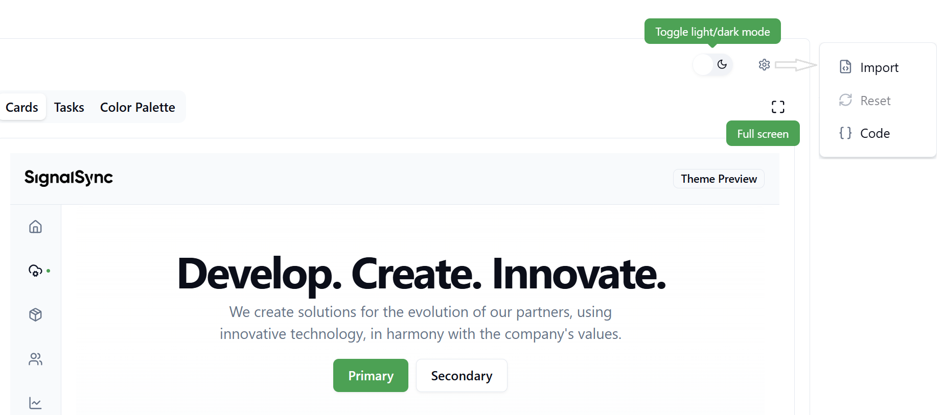
Toggle Light/Dark Mode Switch between light and dark theme variants to see how your colors and styling adapt to both modes. This ensures your brand looks great regardless of user preference.
Settings Menu Click the settings icon to access advanced theme management options:
-
Import: Upload custom CSS code to apply advanced styling
- Opens a dialog where you can paste CSS variables
- Supports standard CSS custom properties format
- Useful for importing themes from external design systems
-
Reset: Revert to previous theme state if imported CSS causes issues
- Returns theme to the last saved configuration
- Helpful recovery tool after experimental imports
-
Code: View the generated CSS code for your current theme
- Displays all CSS custom properties and their values
- Useful for exporting themes or understanding color relationships
- Can be copied and shared with developers
Full Screen Preview Click the full-screen icon to expand the preview to your entire screen, providing a more accurate representation of how the theme will appear to users in normal use.
Preview Tabs
The preview area includes three tabs demonstrating different aspects of your theme:
- Cards: Shows how cards, buttons, and primary UI components appear
- Tasks: Displays data tables and list views with your theme applied
- Color Palette: Comprehensive view of all color variables in your theme, organized by category
The Color Palette tab is particularly useful for reviewing color relationships and ensuring sufficient contrast between foreground and background colors for accessibility.
Saving and Applying Themes
After customizing your theme, you need to save and apply it to make the changes visible to all users.
Workflow: Edit → Save → Apply
-
Edit: Make your desired changes in the Colors, Typography, or Other tabs
- The preview updates in real-time as you adjust settings
- Experiment freely - changes aren't applied until you click Apply
-
Save: Click the Edit button, then save your theme with a name
- Opens a dialog to name your custom theme
- Your theme will be added to "Saved Themes" for future use
- You can create multiple theme variations and switch between them
-
Apply: Click the Apply button to push your theme to all users
- Immediately updates the appearance for all users in the tenant
- Both light and dark mode variants are updated simultaneously
- No user action or page refresh required
Always use the Edit button to save your theme with a descriptive name before clicking Apply. This creates a restore point and allows you to return to this configuration in the future if needed.
Advanced Theme Import
For organizations with existing design systems or developers who prefer working with CSS directly, SignalSync supports custom CSS import.
Importing Custom CSS
- Click the settings icon in the preview area
- Select Import from the menu
- Paste your CSS custom properties into the dialog
- Click Import to apply the CSS
CSS Format Requirements:
:root {
  --background: 223.81 -172.52% 100.00%;
  --foreground: 225.00 44.50% 7.06%;
  --primary: 142.12 76.16% 36.29%;
  /* Additional CSS variables */
}

.dark {
  --background: 225.00 44.50% 7.06%;
  --foreground: 210.00 39.97% 98.05%;
  /* Dark mode variants */
}
The CSS should include:
- A
:rootblock for light mode variables - A
.darkblock for dark mode variants - Standard CSS custom property syntax
Importing custom CSS overrides all current theme settings. Use the Reset option if the imported CSS causes display issues. Consider saving your current theme before importing to preserve your work.
User Experience with White Labeling
How Users Experience Branding
Once you apply white labeling settings, all users in your tenant will immediately see:
- Your organization's logos in the navigation sidebar
- Custom login background on the authentication page
- Branded color scheme throughout the interface
- Your selected typography for all text content
- Customized UI element styling (radius, shadows, etc.)
User Control: Light/Dark Mode
While Tenant Administrators control the overall branding, individual users retain the ability to switch between light and dark interface modes based on their preference.
Switching Theme Mode (User Level):
Users can toggle between light and dark modes by:
- Clicking their profile avatar in the bottom-left corner
- Selecting Theme from the user menu
- Clicking the theme toggle to switch between light and dark modes
Important: User theme mode selection only affects the light/dark color variant. All branding elements (logos, colors, typography) configured by the Tenant Administrator remain consistent in both modes. The system ensures proper color adaptation for readability and contrast in each mode.
Best Practices
When implementing white labeling for your SignalSync tenant, consider these recommendations:
Logo Design
- Create logo variants optimized for both light and dark backgrounds to ensure visibility in all contexts
- Keep logo marks simple and recognizable at small sizes when the sidebar is collapsed
- Use transparent PNG files for logos to allow flexible placement on various backgrounds
- Test logos at different screen resolutions to ensure clarity on all devices
Color Selection
- Ensure sufficient contrast between text and backgrounds for accessibility (WCAG AA minimum: 4.5:1 for body text)
- Test your color scheme in both light and dark modes using the preview toggle
- Use the Color Palette preview tab to verify color relationships across all UI elements
- Consider colorblind users - don't rely solely on color to convey important information
Typography
- Select fonts that are readable at various sizes, especially for small UI text
- Limit font family variations to 2-3 maximum for visual consistency
- Test monospace fonts with actual code or data examples in the Fonts Showcase
- Consider load times - system fonts perform better than custom web fonts
Theme Testing
- Use the full-screen preview to evaluate your theme in a realistic context
- Review all three preview tabs (Cards, Tasks, Color Palette) before applying
- Test critical workflows after applying to ensure usability with your color scheme
- Save multiple theme variations to quickly switch between options for testing
Workflow Management
- Name your saved themes descriptively (e.g., "Brand Primary - Light" rather than "Theme 1")
- Document your color codes and font choices outside SignalSync for reference
- Consider creating seasonal or campaign-specific theme variants in advance
- Regularly review and update branding to ensure consistency with organization-wide design updates
Troubleshooting
Common Issues and Solutions
Logos appear distorted or pixelated
- Upload higher resolution images (2x or 3x the display size)
- Ensure image dimensions are proportional to the display area
- Use PNG format with appropriate transparent areas
Colors look different than expected
- Verify color values in the Code view to ensure accurate input
- Check the Color Palette preview for unintended color relationships
- Toggle between light and dark modes to verify both variants
- Some colors may be constrained by accessibility requirements
Login background not displaying
- Verify image file size is under 2 MB limit
- Check image format is JPEG, PNG, or WebP
- Ensure image has sufficient resolution for large displays
Theme changes not applying to users
- Confirm you clicked both Edit (to save) and Apply (to deploy)
- Verify users refresh their browsers or wait for automatic refresh
- Check that you have Tenant Administrator permissions
Imported CSS causes display issues
- Use the Reset option in the Settings menu to revert
- Verify CSS format matches the required structure (:root and .dark blocks)
- Ensure all required CSS custom properties are included
Summary
White Labeling empowers Tenant Administrators to create a fully branded SignalSync experience that aligns with your organization's visual identity. From logos and login backgrounds to comprehensive theme customization, you can ensure every user interaction reflects your brand.
Key capabilities include:
- Upload custom logos and login backgrounds with full light/dark mode support
- Select from predefined themes or create custom themes from scratch
- Customize colors, typography, and detailed UI styling with granular controls
- Preview changes in real-time before applying to all users
- Import advanced CSS for integration with existing design systems
- Ensure consistent branding while allowing users personal light/dark mode preference
Remember that effective white labeling balances brand identity with usability - always test your themes thoroughly using the preview features before applying them to your entire organization.