Reports & Analytics
The SignalSync Facility Maintenance application includes a reporting engine designed to give Service Providers and Managers real-time visibility into operational performance. Every role in the application can have one or more Dashboards assigned, presenting the most representative reports and KPIs for that role, along with a standard process grouping the related reports.
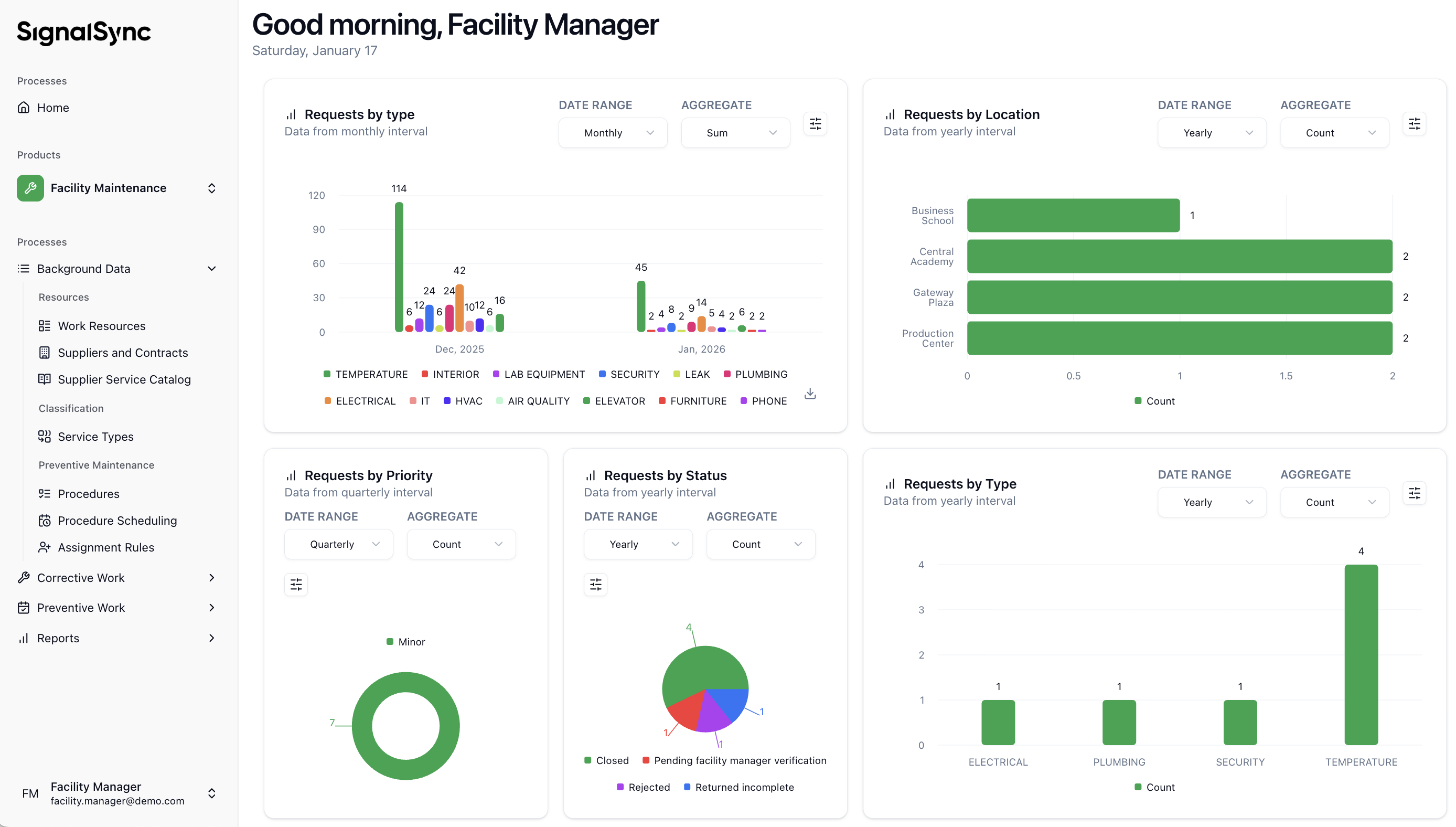
Dashboard Sample
Click to view a Dashboard sample
Accessing Reports
To access the reporting dashboard, click on the Reports process in the main navigation menu.
The default view shows the Requests by Status report, which groups maintenance tickets by their current status (e.g., Open, Closed, In Progress) and displays them over a timeline.
The primary report available in the Reports process is the Requests by Status report, which allows for dynamic analysis of maintenance volume and resolution progress, grouped by status. Additional standard reports are available; this section uses "Requests by Status" to explain the general interaction options.
Click to view the Requests by Status report
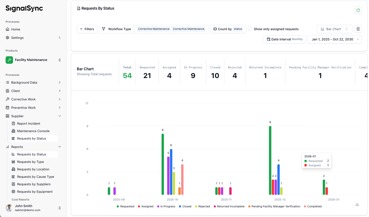
This report provides a high-level analytical view of maintenance workflow performance. It allows managers to monitor the distribution of tasks across lifecycle stages such as "Requested," "In Progress," and "Closed".
General Options: Filtering & Grouping
The top section of the report contains tools to refine the data displayed in the bar chart:
- Filters: Allows you to narrow down data by specific criteria (e.g., by a specific building or priority level).
- Workflow Type: Set to Corrective Maintenance in this example, focusing the report on on-demand repairs rather than scheduled tasks.
- Count by: Set to Status, which groups the data into the distinct stages of the maintenance flow.
- Date Interval & Range: Set to a Monthly interval with a custom date range (Jan 1, 2025 – Oct 22, 2030), allowing for long-term trend analysis.
Interacting with the Report
The report is designed for both at-a-glance monitoring and detailed investigation:
- Drill-Down Capability: Clicking on a specific bar in the chart (e.g., the green "Requested" bar for 2025-10) drills down into a detailed list of those specific requests.
- Data Export: Once in the list view, you can export the data to a CSV file, which can be opened in Excel for further offline reporting or auditing.
- Real-time Tooltips: Hovering over a bar reveals a tooltip showing the exact counts for that specific month (e.g., 2 Requested, 1 Assigned).
Field Descriptions (Status Summary)
The summary bar provides the total volume followed by a breakdown of the workflow stages, with filtering, drill-down, and export capabilities available on click:
| Field | Meaning & Context |
|---|---|
| Total (54) | The grand total of all corrective requests within the selected date range. |
| Requested (21) | New incidents reported but not yet dispatched or assigned to a supplier. |
| Assigned (4) | Tasks dispatched to a specific Supplier but where work has not yet started. |
| In Progress (9) | Active work currently being performed by the Supplier. |
| Closed (10) | Successfully completed and finalized tasks. |
| Rejected (4) | Requests cancelled by a Supervisor or denied by a Facility Manager. |
| Returned Incomplete (1) | Tasks sent back to the Supplier because the work did not pass initial inspection. |
| Pending FM Verification (1) | High-cost tasks waiting for the Facility Manager to approve the final costs. |
| Completed (4) | Tasks finished by the Supplier and awaiting final Supervisor verification or Client closure. |
Visual Trends
In this example, the bar chart shows a significant spike in activity during October and December 2025, which may indicate seasonal maintenance trends or a high volume of reporting during those periods.
Visualization Options
The report engine is flexible and allows you to visualize data in the format that best suits your needs. You can switch between different chart types using the dropdown menu at the top of the chart:
Click to view available Chart Types
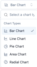
- Bar Chart: Best for comparing volumes side-by-side.
- Line Chart: Best for spotting trends over time.
- Pie Chart: Best for showing the distribution of the total workload (e.g., what percentage of tickets are Urgent?).
- Donut Chart / Radar Chart: Alternative visualization methods.
Click to view Bar Chart Options

The Bar Chart Options panel allows you to customize the visual presentation of your reports to make data interpretation more intuitive. These settings control the layout, labeling, and interactive elements of the bar charts. Each chart type has a similar Chart Options panel.
Click to view Report Parameters
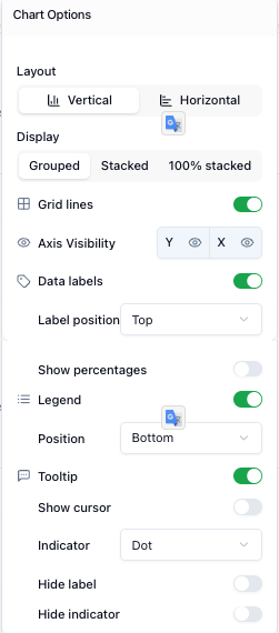
A. Layout & Display
These settings define the core structure of the chart:
- Layout: Toggle between a Vertical (standard columns) or Horizontal orientation.
- Display Mode:
- Grouped: Shows individual bars side-by-side for each category.
- Stacked: Layers categories on top of each other within a single bar to show parts of a whole.
- 100% Stacked: Shows the relative percentage of each category, with all bars reaching the same total height.
B. Axis & Grid Controls
- Grid Lines: A toggle to show or hide background lines that help align data points visually.
- Axis Visibility: Independent controls to show or hide the Y-axis (values) and X-axis (categories/time).
C. Data Labels
- Data Labels: A toggle to display the exact numerical value directly on the bars.
- Label Position: A dropdown to choose where the numbers appear (e.g., Top).
- Show Percentages: An optional toggle to display the percentage value alongside or instead of the raw count.
D. Legend & Interactivity
- Legend: A toggle to show the color-coded key for statuses (e.g., "Requested", "Closed"). You can also set its Position (e.g., Bottom).
- Tooltip: A toggle to enable the hover-over information box that shows detailed data when pointing at a bar.
- Show Cursor: Highlights the exact point being hovered over.
- Indicator: Allows you to choose the visual style of the hover indicator (e.g., a Dot).
- Label/Indicator Hiding: Advanced options to Hide Label or Hide Indicator within the tooltip for a cleaner look.
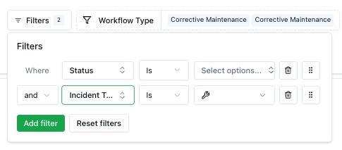
Filtering Data
To analyze specific subsets of data (e.g., only "Urgent" tickets or only tickets from a specific building), use the global filter:
- Click the Filters button.
- Click Add Filter.
- Select the field to filter by (e.g., Status, Priority, Location).
- Select the condition and value (e.g., Status IS "In Progress").
Multiple filters can be combined using AND / OR conditions between them.
Click to view Filter Options
Examples:
- Create a view that only shows "Finalized" and "Closed" tickets to analyze completed work.
- Create a view that only shows "Corrective Maintenance" tickets to analyze the workload by status.
Grouping & Aggregation
The report allows you to change how data is sliced. By default, it groups by Status, but you can change the Count by setting to analyze different dimensions:
- By Workflow Type: Separate "Corrective Maintenance" from "Preventive Maintenance" to see the balance of reactive versus planned work.
- By Status: See how many tickets are stuck in "Pending" versus "Active".
Time Intervals
You can adjust the time window for the report to analyze performance over different periods. Use the Date Interval selector to choose:
- Daily: For immediate operational control.
- Weekly: For team planning.
- Monthly: For billing and SLA reporting.
- Quarterly/Yearly: For long-term trend analysis.
You can also manually select a custom date range to focus on a specific period.
Exporting Data
For offline analysis or integration with other systems, you can export the raw data from the Maintenance Console:
- Navigate to the Maintenance Console list view.
- Apply any necessary filters to the list.
- Click the Export icon in the toolbar.
- Select Download CSV.
This generates a .csv file containing all details of the selected requests, including IDs, timestamps, costs, and assigned providers.