Report Builder
The Report Builder is an interactive crosstable reporting tool available in the SignalSync Graphical Workflow Engine (GWE) under Manage → Report Builder. It allows authorized users to analyze workflow request data across two grouping dimensions simultaneously, combining a visual bar chart with a detailed crosstable and summary KPI cards.
Unlike the Report Generator — which focuses on time-series chart visualization — the Report Builder produces structured tabular analysis across any two dimensions (e.g., Building × Status, Supervisor × Priority, Building × Estimated Cost).
Report Builder is available in the Manage section of the GWE navigator, alongside Workflows and Reports Generator.
Overview
The Report Builder page is composed of four main areas:
- Configuration panel — workflow selection, filters, and grouping dimensions
- Date range selector — restrict data to a specific period
- KPI Summary cards — aggregate totals per column dimension value
- Chart and Crosstable — stacked bar chart and detailed crosstable with export
Configuration Panel
The configuration panel sits at the top of the page and controls which data is analyzed and how it is grouped.
Click to view Configuration Panel interface
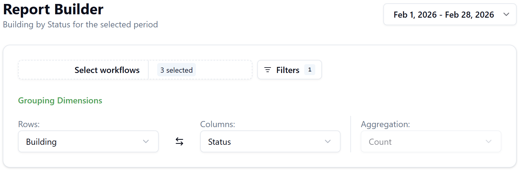
Select Workflows
Click Select workflows to open the workflow picker. The panel shows all published workflows in the tenant, grouped under Form fields, each with a checkbox and version indicator.
- Use the search box to filter the list by workflow name
- Click Select All or Deselect All for quick bulk selection
- The button badge shows the count of selected workflows (e.g., 3 selected)
- Click Clear to deselect all
When multiple workflows are selected, the system identifies fields that exist in all selected workflows. Only these common fields are available in the Row/Column dropdowns and Filters. If you add or remove a workflow, the available fields update immediately and active filters are cleared.
Example: Common fields across two workflows
If you select Corrective Maintenance and Preventive Maintenance, and both workflows contain the fields status, priority, building, supervisor, estimated_cost, and actual_cost, those six fields become available for grouping and filtering.
Fields that exist in only one of the selected workflows (e.g., schedule_code, procedure_code) are excluded.
Filters
Click Filters to open the filter panel. Each row defines a condition applied to the full data set before grouping. Multiple rows are combined with AND logic.
Each filter row contains:
| Element | Description |
|---|---|
| Field | Any common field from the selected workflows |
| Operator | Depends on field type: Is for reference/text fields |
| Values | Searchable multi-select with entity detail cards (Code, Name, Address) |
| Delete | Removes the filter row |
Click Add filter to insert a new row. Click Reset filters to clear all conditions. The Filters button badge shows the count of active conditions.
Grouping Dimensions
The Grouping Dimensions section defines the two axes of the crosstable. It contains three controls displayed in a horizontal row:
Rows
Defines the primary grouping dimension — the row labels in the crosstable and the X-axis values in the bar chart.
- Available options: all text/categorical common fields (e.g., Building, Priority, Supervisor, Incident Type, Repair Type, Cause Type, Supplier)
- Numeric fields (Estimated Cost, Actual Cost, Estimated Duration) are excluded from Rows, as continuous values do not form meaningful row groups
- Cannot select the same field currently selected in Columns
Columns
Defines the secondary grouping dimension — the column headers in the crosstable and the color series in the bar chart.
- Available options: all common fields, including numeric fields (Estimated Cost, Actual Cost, Estimated Duration)
- Cannot select the same field currently selected in Rows
- The swap button (⇄) between Rows and Columns swaps both selections instantly
When a numeric field is selected as the Column, the report switches to a financial aggregation mode: each row shows the sum of that field rather than a count breakdown.
Aggregation
The Aggregation control is read-only and set automatically based on the Column selection:
| Column type | Aggregation | Meaning |
|---|---|---|
| Text / categorical field | Count | Number of requests per Row × Column combination |
| Numeric field | Sum | Total value of the numeric field per Row value |
Example: Count mode — Building by Status
- Rows: Building, Columns: Status, Aggregation: Count (auto)
- Result: a crosstable where each cell shows how many requests exist for a given building and status combination
- Chart: stacked bar chart, one bar per building, segments per status
Example: Sum mode — Building by Estimated Cost
- Rows: Building, Columns: Estimated Cost, Aggregation: Sum (auto)
- Result: a single-column crosstable showing the total estimated cost per building
- Chart: simple bar chart, one bar per building showing the summed cost
- KPI strip: a single card showing the grand total
Date Range
The date range picker is located in the top-right corner of the page. It controls which requests are included based on their creation date.
Default: the last complete calendar month (e.g., if today is March 11, 2026, the default range is Feb 1 – Feb 28, 2026).
Click the date range button to open the picker, which includes:
- A dual-month calendar with range highlighting
- Preset shortcuts: Today, Yesterday, Last 7 days, Last 14 days, Last 30 days, This Week, Last Week, This Month, Last Month (default, marked with ✓), This Year
- Manual date entry fields at the top
- Cancel to discard changes, Update to apply
Future dates cannot be selected. The maximum selectable range is 2 years.
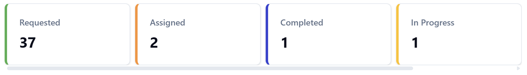
KPI Summary Cards
Below the configuration panel, a row of summary cards provides a quick overview of totals.
When Column is a text/categorical field: One card per unique column value (e.g., one card each for Requested, Assigned, Completed, In Progress, Returned), each showing a colored left border and the aggregate count. Colors match the chart series.
When Column is a numeric field: A single card showing the grand total sum of that field (e.g., Estimated Cost: 5,380.8).
Click to view KPI Summary Cards interface
Bar Chart
The chart visualizes the same data as the crosstable.
Click to view Bar Chart interface
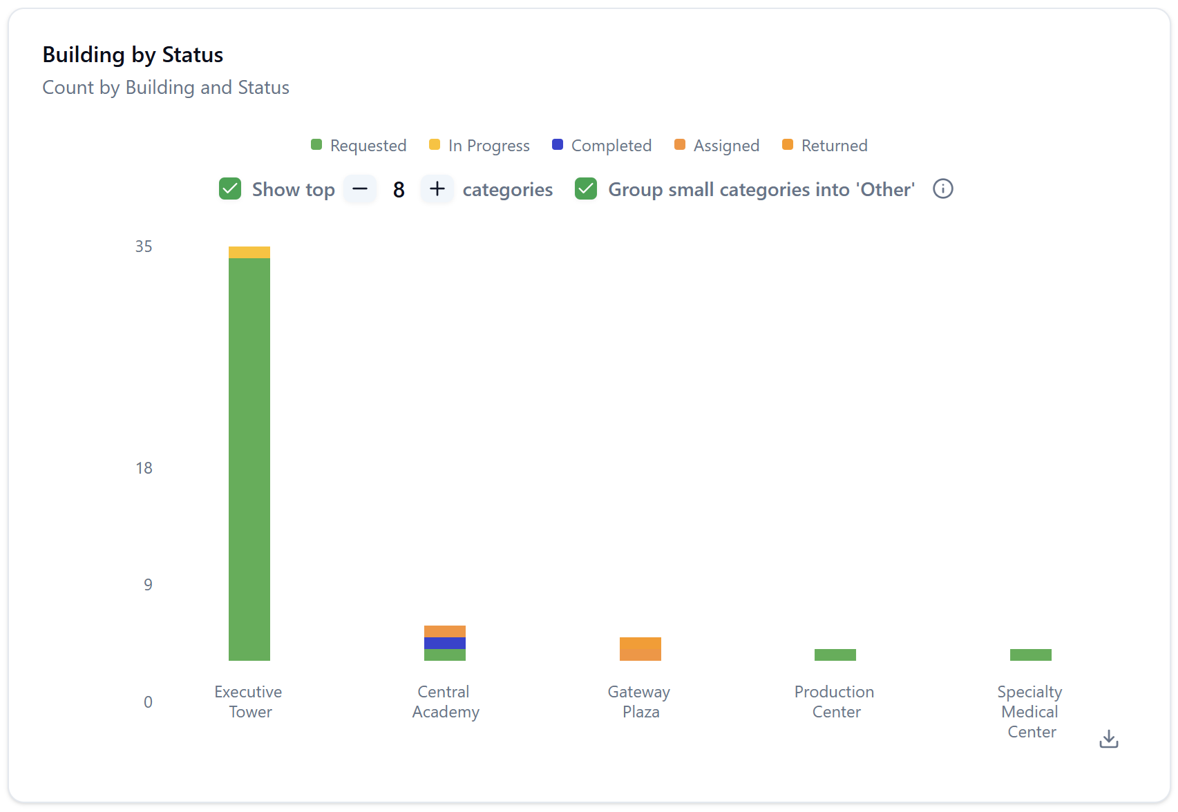
Count mode (text Column):
- Stacked bar chart
- X-axis: Row dimension values (e.g., building names)
- Y-axis: Count
- Each bar is divided into colored segments, one per Column value
- Legend at the bottom maps colors to Column values
- Chart title: [Column] by [Row] (e.g., Building by Status)
- Subtitle: Count by [Row] and [Column]
Sum mode (numeric Column):
- Simple bar chart (not stacked)
- X-axis: Row dimension values
- Y-axis: Sum values
- Single color series — no legend needed
- Chart title: [Column] by [Row] (e.g., Building by Estimated Cost)
- Subtitle: Sum by [Row] and [Column]
The chart controls at the bottom of the chart area are shared with the Report Generator: Show top N categories (adjustable with −/+) and Group small categories into 'Other'.
Request Crosstable
Below the bar chart, the Request Crosstable presents the same data in tabular form.
Click to view Request Crosstable interface
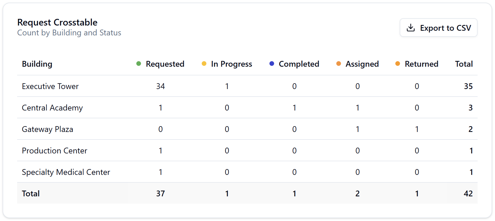
- Column headers include a color dot matching the chart legend
- Empty cells display 0 (never blank)
- The Total column sums each row; the Total row sums each column
- The grand total (bottom-right cell) must equal the sum of all row totals
Reference fields (such as Supervisor) are always displayed as human-readable names, not internal IDs.
Export to CSV
Click Export to CSV (top-right of the crosstable) to download the full table as a CSV file.