Report Generator
The Report Generator is an interactive analytics tool available in the SignalSync Graphical Workflow Engine (GWE) that allows authorized users to build, configure, and publish dynamic chart-based reports from workflow request data. Reports are configured entirely through the toolbar — no code required — and can be saved as named tasks in the application navigator for repeated use.
Report Generator is available in the Manage section of the GWE navigator, alongside Workflows and Reports Builder.
Overview
The Report Generator page is composed of three main areas:
- Toolbar — all configuration controls for filters, aggregation, chart type, and date range
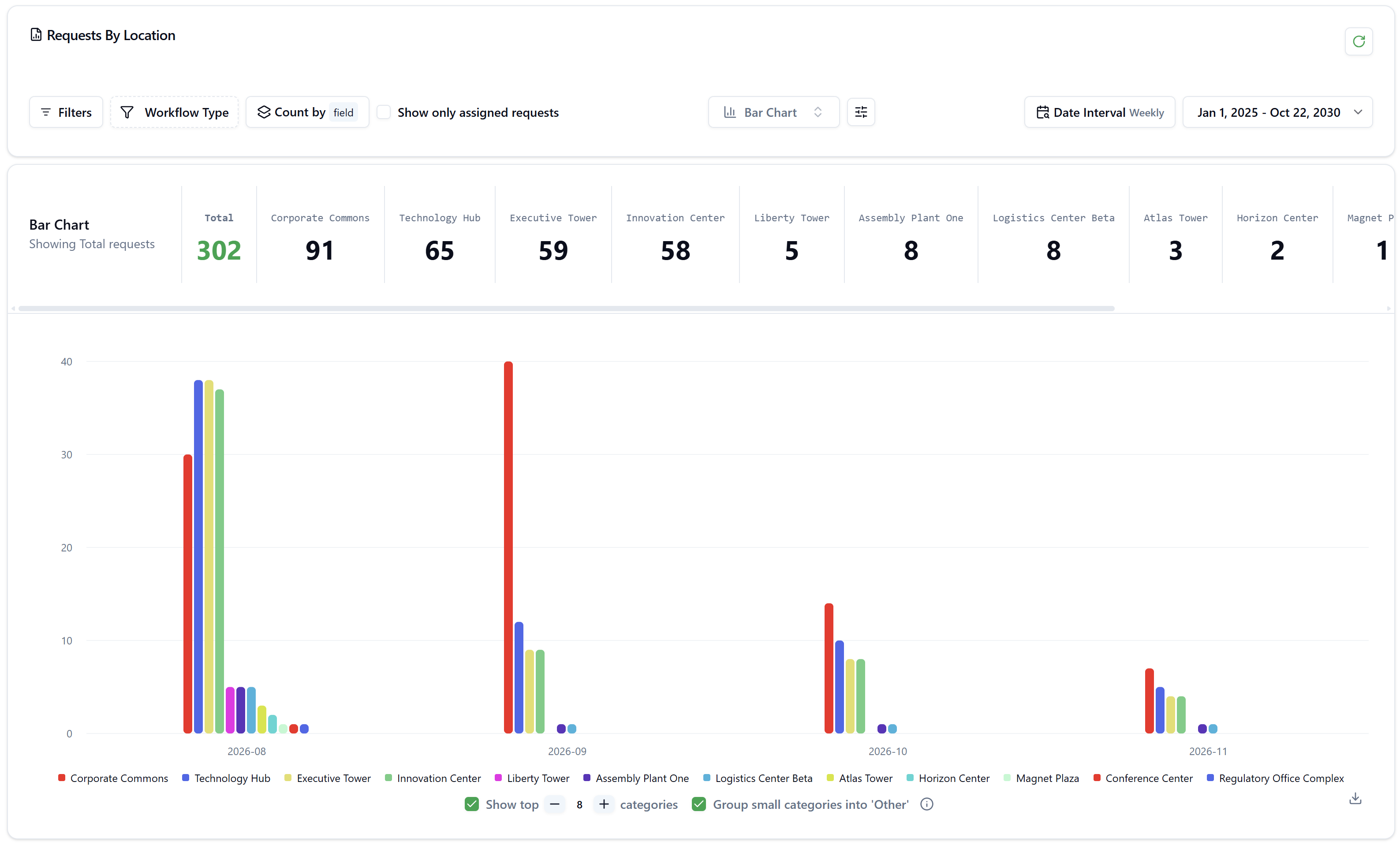
- KPI Summary Strip — a scrollable row of aggregate totals per category (e.g., per status or per building)
- Chart Area — the interactive visualization with legend, tooltips, and drill-down capability
The X-axis always represents the date dimension, grouped by the selected Date Interval. The Y-axis represents the aggregate metric (count, sum, average, etc.). The color-coded series represent the grouped dimension (status, building, priority, etc.).
Click to view Report Generator interface
Toolbar Controls
The toolbar runs across the top of the page and contains all controls for configuring the report.
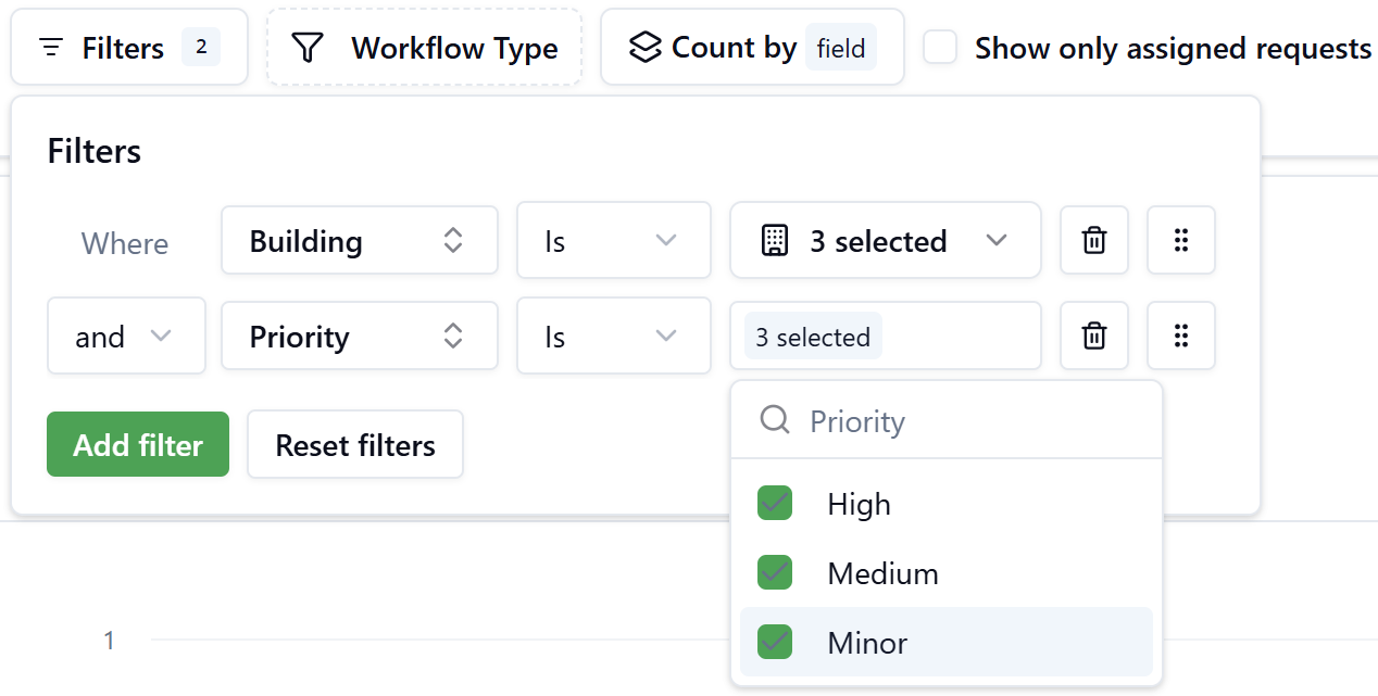
Filters
Click Filters to open the filter panel. Each filter row defines a condition in the form:
Where
[Field]Is[Values]
Multiple rows are combined using And / Or connectors. Clicking Add filter inserts a new row.
Each row contains:
- Field selector — choose any workflow form field (e.g., Building, Priority, Incident Type)
- Operator — currently supports Is (multi-select)
- Values picker — a searchable multi-select dropdown. For entity fields (such as Building), each result displays structured detail cards (Code, Name, Address). Selected items are shown as a count badge (e.g., 3 selected).
- Delete and drag-to-reorder icons on each row
- Reset filters — clears all active filter conditions
The Filters button shows a badge with the count of active filter conditions.
Example: Filtering by Building and Priority
To show only high-priority requests in three specific buildings:
- Click Filters
- Add a filter: Where Building Is → select Research Park Delta, Quantum Tower, Magnet Plaza
- Click Add filter
- Add a second row: Where Priority Is → select High, Medium, Minor
- Close the panel — the chart updates immediately
Workflow Type
The Workflow Type control lets you restrict the report to specific workflow definitions. Click it to open a searchable dropdown listing all published workflows under the Form fields group, each tagged with a Latest badge indicating the active version.
Select one or more workflows by checking their checkboxes. Selected workflows appear as pills in the toolbar. Click Clear to deselect all.
When multiple workflow types are selected, the report aggregates data across all of them. Use this to compare request volumes or costs across different processes.
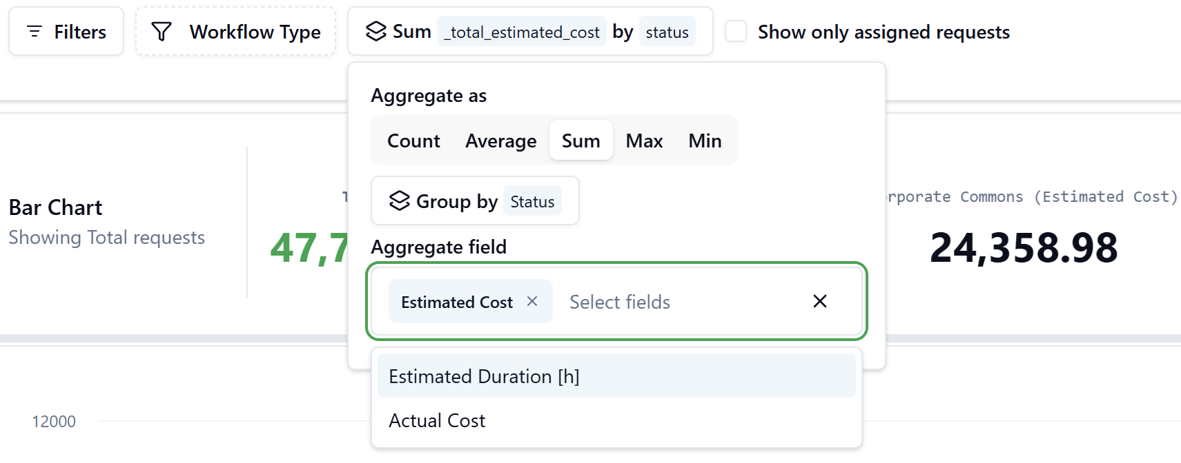
Count by / Aggregate
Click the Count by control to open the aggregation popup. This control defines what the Y-axis measures and how data is grouped into series.
| Section | Options | Description |
|---|---|---|
| Aggregate as | Count, Average, Sum, Max, Min | How to compute the Y-axis value |
| Group by | Status, Field | What dimension drives the color series. Choose Status to split bars by workflow status, or Field to split by any form field |
| Aggregate field | (appears for Sum / Average / Max / Min) | The numeric form field to aggregate, e.g., Estimated Cost, Estimated Duration, Actual Cost. Supports multi-select |
The toolbar label updates to reflect the current selection, e.g., Sum _total_estimated_cost by status or Count by field.
Example: Sum of Estimated Cost by Status
- Click Count by status
- Set Aggregate as → Sum
- Set Group by → Status
- Under Aggregate field, select Estimated Cost
- Close — the KPI strip now shows totals per status (Assigned, Completed, InProgress, Requested), and bars reflect the summed cost values
Example: Count by Building (Group by Field)
- Click Count by
- Set Aggregate as → Count
- Set Group by → Field, then select Building from the field search list
- Close — each color series now represents a building, and totals per building appear in the KPI strip
Show Only Assigned Requests
A toggle that, when enabled, restricts the data to requests where the current user is the assignee. Useful for personal workload views when publishing reports for individual roles.
Chart Type
Click the chart icon to open the Chart Types dropdown. The following chart types are available:
| Chart Type | Best used for |
|---|---|
| Bar Chart | Comparing volumes or values across categories over time |
| Line Chart | Showing trends and changes over time |
| Pie Chart | Showing proportional distribution across categories (no date axis) |
| Area Chart | Cumulative trends and volume over time |
| Radial Chart | Compact circular comparison across categories |
Pie and Radial charts display the total aggregated by the group dimension without a date X-axis.
Chart Settings
Click the sliders icon (next to Chart Type) to access advanced chart display options, including axis labels, data labels, grid lines, legend position, and tooltip behavior.
Date Interval
Sets the X-axis granularity. Available intervals:
- Daily — one bar group per day
- Weekly — one bar group per week
- Monthly — one bar group per month
- Quarterly — one bar group per quarter
- Yearly — one bar group per year
The selected interval affects how data points are bucketed on the X-axis.
Date Range
Click the date range area (showing e.g., Jan 1, 2026 – Mar 11, 2026) to open the date range picker. You can:
- Click any day in the dual-month calendar to set start and end dates manually
- Use the preset shortcuts on the right side: Today, Yesterday, Last 7 days, Last 14 days, Last 30 days, This Week, Last Week, This Month, Last Month, This Year
- Edit the date fields directly at the top of the picker
- Click Update to apply or Cancel to discard changes
The date range filters records by their creation date (or the date field used for the X-axis dimension).
KPI Summary Strip
Below the toolbar, a horizontally scrollable strip displays aggregate totals for each category in the current group dimension. For example:
- When Group by Status: columns show Total, Requested, Assigned, In Progress, InProgress, Completed
- When Group by Building: columns show Total, Technology Hub, Executive Tower, Innovation Center, …
The Total value represents the grand total across all categories and the selected date range. Each category column shows its individual aggregate.
Chart Area
The main chart area displays the visualization based on all toolbar selections.
Top-N Categories and Grouping
At the bottom of the chart, two controls manage how many categories are displayed:
- Show top N categories — use the − and + buttons to adjust how many of the top categories appear as individual series (default: 8). Categories are ranked by total value descending.
- Group small categories into 'Other' — when enabled, all categories outside the top N are merged into a single Other series. The info icon explains the behavior.
Tooltips
Hovering over any bar or data point shows a tooltip with:
- The date bucket label
- A breakdown of each series value for that date
Drill-Down to Request Details
Clicking on any bar opens the Report Chart Details modal, which shows the individual workflow requests that make up that data point.
The modal includes:
- A subtitle showing the aggregate condition (e.g., Count by
_building: 36) - An accordion section per workflow type (e.g., Preventive Maintenance)
- A paginated data grid with columns: Request Id, Status, Requestor, Created At, Archived At, and form-specific columns
- Status column filter and Show Archived Items toggle
- CSV export button and column chooser button
- Pagination controls with configurable rows per page
Publishing a Report
Once you have configured the report to your satisfaction, click Publish in the top-right corner. A right-side drawer opens with the following fields:
| Field | Description |
|---|---|
| Process | The process (navigation group) where this report will appear as a menu item |
| Name | The display name of the task in the navigator |
| Additional Languages | Localized names for multi-language tenants |
| Description | A short description of the report |
| URL | Auto-generated URL encoding all current configuration parameters (read-only). Copy button and character count are provided |
| Icon | The icon displayed next to the task name in the navigator |
| Order | Numeric position within the process. Lower numbers appear first. The system suggests a value based on existing tasks |
Click Publish at the bottom of the drawer to save. The report becomes accessible as a named menu item in the selected process for all users with access to that process.
The auto-generated URL encodes the full report configuration — chart type, aggregate, group by, filters, date interval, and display settings. Users who open the published task always see the report with the same configuration you defined at publish time.
Example: Publishing a 'Requests by Building' report
- Configure the chart: Workflow Type = Corrective Maintenance + Preventive Maintenance, Count by = Field → Building, Chart Type = Bar Chart, Date Interval = Monthly, Date Range = This Year
- Click Publish
- Set Process → Reports
- Set Name → Requests by Building
- Set Description → Requests by Building report
- Set Icon → choose an appropriate icon
- The Order field is auto-suggested (e.g., 111)
- Click Publish — the task now appears in the Reports process navigator for all authorized users