Workflow Forms
The Forms tab allows you to create and manage the data entry forms used within your workflow. Each form corresponds to a specific step in your business process — capturing the information needed to move the request forward. Forms are built using a visual drag-and-drop designer and can be reused across multiple workflow tasks.
Path: Define → Workflows → [Select Workflow] → Forms Tab
Forms List
When you open the Forms tab, you see a list of all forms defined for the current workflow.
Click to view Form List interface
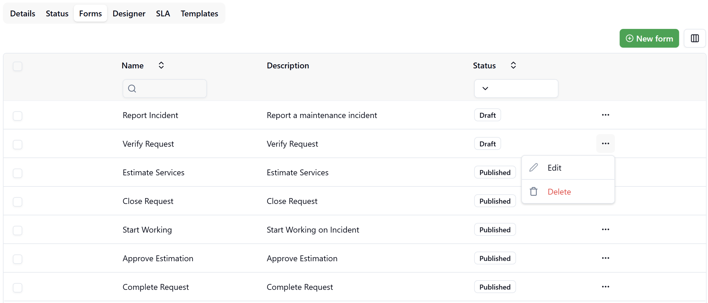
| Column | Description |
|---|---|
| Name | The display name of the form |
| Description | A brief description of the form's purpose |
| Status | Draft or Published |
Form Status
Each form exists in one of two states:
- Draft — The form is under construction and cannot yet be assigned to a workflow task. Forms in Draft status are visible in the list but not available for selection in the Designer.
- Published — The form is finalized and available for selection when configuring User Tasks in the Workflow Designer.
Actions
The actions available in the ··· (three-dot) menu depend on the form's current status:
Draft forms:
- Edit — Opens the form in the Form Designer.
- Delete — Permanently removes the form. This action is irreversible.
Published forms:
- View — Opens a read-only preview showing exactly how the form will appear to end users, including the responsive layout across device sizes.
- Unpublish — Reverts the form status back to Draft, making it editable again. The form will no longer be available for selection in the Workflow Designer until it is re-published.
To protect workflow integrity, published forms cannot be deleted directly. To remove a published form, first Unpublish it to return it to Draft status, then delete it.
Creating a New Form
Click New form (top-right corner) to create a new form. Provide a name and optional description, then click Save to open the Form Designer.
Form Designer
The Form Designer is a visual canvas where you construct the form layout by dragging elements from the left panel onto the center canvas. A live preview is shown on the right.
Click to view Form Designer interface
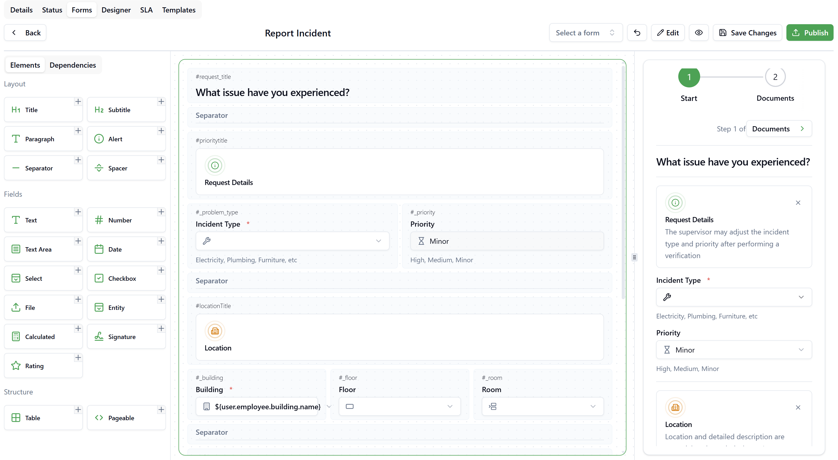
Layout of the Designer
| Area | Description |
|---|---|
| Left panel — Elements & Dependencies | Palette of all draggable elements organized by category |
| Center canvas | The form design surface where you build the layout |
| Right panel | Live preview of how the form will appear to end users |
Use the eye icon (👁) in the top bar to open a full-screen preview of the form at any time. The preview header displays "Form Published — This is how your form will look like to your users" when the form has been published. Use the device-size toggle buttons (desktop / tablet / mobile) at the top-left of the preview to check the layout across different screen sizes.
Form Elements
Elements are organized into three categories in the left panel.
Layout Elements
Used to structure the visual presentation of the form.
| Element | Description |
|---|---|
| Title | Large H1 heading, used to label sections |
| Subtitle | Smaller H2 heading for sub-sections |
| Paragraph | Static descriptive text block |
| Alert | Highlighted informational or warning message |
| Separator | Horizontal rule to visually divide sections |
| Spacer | Adds vertical whitespace between elements |
Field Elements
Capture user input. Drag them onto the canvas and configure their properties in the Element Properties panel on the left.
| Element | Description |
|---|---|
| Text | Single-line text input |
| Number | Numeric input field |
| Text Area | Multi-line text input |
| Date | Date picker input |
| Select | Dropdown list with predefined options |
| Checkbox | Boolean toggle |
| File | File upload field |
| Entity | Lookup selector bound to a Background Data entity (see below) |
| Calculated | Field whose value is computed from an expression |
| Signature | Signature capture field |
| Rating | Star rating input |
Structure Elements
| Element | Description |
|---|---|
| Table | Tabular data entry component |
| Pageable | Splits the form into multiple named pages (steps), displayed as a step indicator at the top of the form |
Configuring an Element
Click on any element placed on the canvas to open the Element Properties panel on the left side.
Common properties available for all field types:
| Property | Description |
|---|---|
| Label | The display name shown above the field |
| Name | Internal field identifier (used in expressions and templates) |
| Placeholder | Hint text shown inside an empty field |
| Helper Text | Additional guidance text displayed below the field |
| Required | When enabled, the user must fill in this field before submitting |
| Readonly | When enabled, the field is visible but cannot be edited by the user |
| Default Value | Pre-filled value; supports binding expressions (see below) |
Entity Fields
The Entity field type creates a lookup selector bound to entities defined in Background Data. This allows users to select values from your master data (for example, Buildings, Floors, Rooms, Employees, Suppliers, Assets).
Selecting an Entity
In the Element Properties panel, use the Entity dropdown to choose from all entities available in your applications. Examples include: Country, County, City, Property, Building, Floor, Room, Room Type, and any custom entities defined in your tenant.
Visible Fields
After selecting an entity, configure which fields from that entity are displayed inside the selector dropdown. Drag the fields into the desired display order using the handle icon (⠿).
Example for a Building entity — visible fields: Code, Name, Address.
On Select
Use the On Select section to trigger actions automatically when the user selects a value from this entity field (for example, auto-populating related fields like Floor or Room when a Building is chosen).
Restrictions
Restrictions filter the list of available records in the entity selector so users can only choose from a relevant subset.
Click + next to Restrictions to open the Restriction definition dialog:
| Setting | Description |
|---|---|
| Name | A descriptive name for the restriction rule (e.g., "Active Buildings") |
| Fields | The entity field to filter on (e.g., Status) |
| Operator | Comparison operator: equals, not equals, etc. |
| Value | The target value to match (e.g., ACTIVE) |
Multiple restrictions can be defined for the same field. Each restriction is displayed as a named badge in the Element Properties panel and can be removed individually.
Restrict Fields
Use Restrict fields to limit the dropdown options of a dependent entity field based on the value selected in the current one. For example, selecting a Building can restrict the Floor dropdown to show only floors that belong to that building.
Click Restrict fields to open the field selection dropdown and check the fields that should be restricted by this selection.
Default Values and Binding Expressions
Any field can be pre-filled using a Default Value. For dynamic values, type $ in the Default Value input to trigger the binding expression autocomplete.
Binding expressions resolve to values from the currently logged-in user's context, enabling the form to automatically populate fields based on the user's profile.
Available Binding Expressions
| Expression | Description |
|---|---|
${user.email} | Email address of the logged-in user |
${user.name} | Full name of the logged-in user |
${user.employee.code} | Employee code linked to the user |
${user.employee.building.code} | Code of the building assigned to the employee |
${user.employee.building.name} | Name of the building assigned to the employee |
${user.employee.phoneMobile} | Mobile phone number of the employee |
${user.supplier.code} | Supplier code linked to the user |
${user.supplier.name} | Name of the supplier linked to the user |
${user.supplier.phone} | Phone number of the supplier linked to the user |
The available expressions depend on the entity type associated with the field. The autocomplete list adapts to show only the expressions that are relevant to the selected entity.
A common pattern is to default the Building field on a request form to the employee's assigned building using:
${user.employee.building.name}
Combined with setting the field as Readonly, this ensures the request is automatically associated with the user's location without requiring manual input.
Pageable Forms (Multi-Step)
Adding a Pageable element to your canvas enables a multi-step form experience. Each page is shown as a numbered step in the progress indicator displayed at the top of the form (e.g., Step 1 of 3: Start → Services → Documents).
Users navigate between steps using the next/previous navigation at the top right of the form. Each page can contain any combination of the elements described above.
Publishing a Form
Once the form design is complete, click Publish in the top-right toolbar.
- A published form transitions from Draft to Published status.
- Published forms become available in the Select a form dropdown in the Form Designer toolbar and in the User Task configuration panel within the Workflow Designer.
Published forms cannot be edited directly. To make changes, click ··· → Unpublish from the Forms list to revert the form to Draft status. You can then open it in the Form Designer, make your changes, and click Publish again.
Using a Form as a Starting Point
A published form can be loaded into the designer canvas as a starting point for a new form. Use the Select a form dropdown in the top toolbar to pick any published form — its layout will load into the canvas. You can then modify the elements and publish the result as a different form.
This is useful when multiple workflow steps share a similar structure but require small differences (for example, a "Report Incident" and "Verify Request" form that share the same incident details section).
Assigning a Form to a User Task
Once published, a form can be assigned to a User Task node in the Workflow Designer:
- Open the Designer tab of the workflow.
- Click on a User Task node to open its properties panel.
- In the Select a form dropdown within the task panel, choose the desired published form.
Only forms with Published status appear in this dropdown.
Troubleshooting
Why does my form not appear in the User Task selector?
Forms must be in Published status to appear in the User Task form selector. If your form is still in Draft, open the form, complete the design, and click Publish. The form will then appear in the selector dropdown.
Can I use the same form in multiple User Tasks?
Yes. A single published form can be assigned to multiple User Tasks within the same workflow or across different workflows. Any changes to the form will affect all tasks it is assigned to. If you need task-specific variations, create separate forms using the existing form as a template (via the Select a form loading feature).
Can I delete a form that is assigned to a task?
Published forms cannot be deleted. To delete a form that is currently published and assigned to one or more User Tasks, first Unpublish it via the ··· menu to return it to Draft status. Before deleting, verify in the Designer that the form is no longer referenced by any User Task, as removing it will leave those tasks without a form assignment.